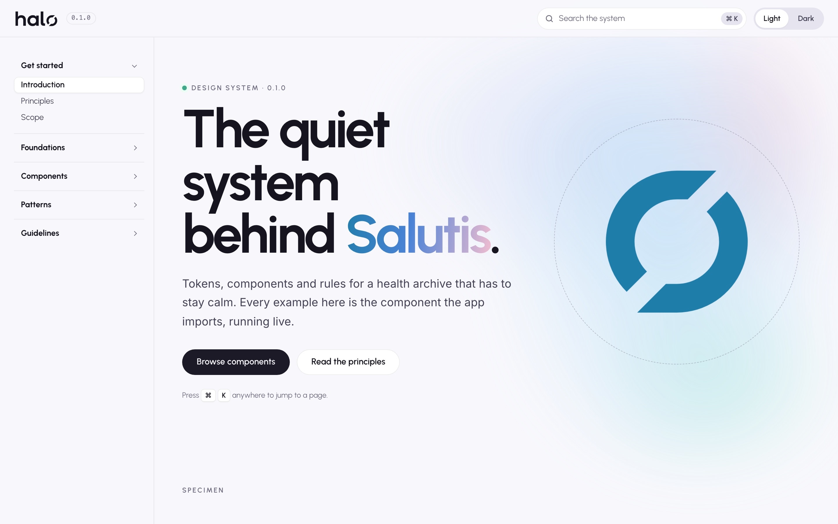
The design system behind Salutis. An audit turned into three token layers, 63 Svelte components and a documentation site that renders the same source the app imports. Adopted inside a live product without breaking it. Designed and built end to end.
- Design system
- Svelte 5
- DTCG tokens
- WCAG 2.2 AA
01The brief
A system for a product that has to stay calm.
Salutis is a private health archive for Mac. People open it to find a lab result, log a medication or prepare for a visit, often at moments that are already stressful. The interface had grown fast, page by page, and the same decisions were being made again on every screen.
I designed and built Halo, the design system behind it, end to end: the audit that sized the problem, the token architecture, the identity, 63 components, the patterns that combine them, the documentation site, and the adoption inside the running app.
The work moved in six phases. Each one produced something the next one could stand on.
- 01
Audit
102 files measured with re-runnable commands. Every duplicate traced to a file and line.
- 02
Architecture
Three token layers in DTCG JSON. One z-index ladder, a duration scale, named breakpoints.
- 03
Identity
The Halo mark: one construction module, two ribbons, a wordmark that uses it as the o.
- 04
Components
63 Svelte 5 components in seven families, redrawn to match the app as it ships.
- 05
Adoption
Adapters that keep the old API, so the running app moved onto Halo without a rewrite.
- 06
Documentation
87 pages rendering the real components, plus scripts for tokens, contrast and status.
02The audit
Count before you design.
Before drawing anything, I audited the renderer: 102 Svelte files, about 86,500 lines. Every number came from a command run against the repository and recorded alongside it, so the audit could be re-run rather than trusted.
The result turned a feeling of inconsistency into an inventory. Button-like class names alone came to 105. Modal backdrops were drawn in 19 files, status badges in 26, toasts in 22, each one a little different from the last.
The audit also mapped all 78 existing components into tiers: what Halo would build new, what it would extract from code the app already trusted, and what would stay domain-specific.
105 class names for one idea
- .action-btn
- .action-btn-small
- .action-button
- .action-buttons
- .add-item-btn
- .add-medication-button
- .add-new-btn
- .add-note-button
- .ai-assistant-btn
- .ai-extract-button
- .auto-detect-btn
- .avatar-btn
- .back-button
- .background-btn
- .btn
- .btn-danger
- .btn-fix-single
- .btn-ghost
- .btn-google
- .btn-group
- .btn-icon
- .btn-icon-dark
- .btn-ignore-file
- .btn-primary
- .btn-secondary
- .btn-select-file
- .btn-signin
- .btn-skip
- .button-group
- .button-icon
- .button-label
- .calendar-button
- .calendar-button-container
- .cancel-btn
- .cancel-button
- .cancel-loading-btn
- .category-dropdown-button
- .change-file-btn
- .clear-all-btn
- .clear-btn
- .close-btn
- .close-button
- .confirm-btn
- .consent-btn
- .copy-btn
- .create-folder-btn
- .create-subfolder-btn
- .delete-btn
- .delete-button
- .download-btn
- .download-button
- .dropdown-button
- .edit-btn
- .empty-trash-btn
- .entity-dropdown-button
- .error-button
- .expand-btn
- .expand-button
- .field-btn
- .file-remove-btn
- .filter-btn
- .floating-toggle-btn
- .footer-btn
- .ghost-btn
- .header-action-btn
- .icon-btn
- .ih-btn
- .import-btn
- .import-calendar-btn
- .inbox-banner-btn
- .lab-analysis-btn
- .label-btn
- .link-button
- .load-more-btn
- .mc-btn
- .mc-btn-confirm-delete
- .mc-btn-danger
- .mode-btn
- .mode-buttons
- .nav-arrow-btn
- .nav-btn
- .nav-buttons
- .new-chat-btn
- .new-folder-button
- .page-btn
- .pill-btn
- .primary-btn
- .regen-btn
- .remove-btn
- .remove-row-btn
- .restore-btn
- .retry-btn
- .save-button
- .secondary-btn
- .sel-btn
- .select-button
- .settings-back-btn
- .sort-btn
- .timerange-dropdown-button
- .tool-btn
- .url-import-button
- .view-all-btn
- .view-button
- .zoom-btn
- .zoom-button
<Button />primary / neutral / secondary / ghost / danger / danger-ghost
The same idea, built again
What exists.
Every section of the audit separates the current state from the proposal, with file and line references, so the inventory can be checked.
What it costs.
A close icon at 2.5:1 contrast. Two type treatments for the same dialog heading. Toast markup in 22 files and one actual toast component.
What Halo proposes.
Three token levels, one z-index ladder, a duration scale, named breakpoints, and an icon that inherits its colour instead of a CSS filter chain.
03Components
Sixty-three components, one source.
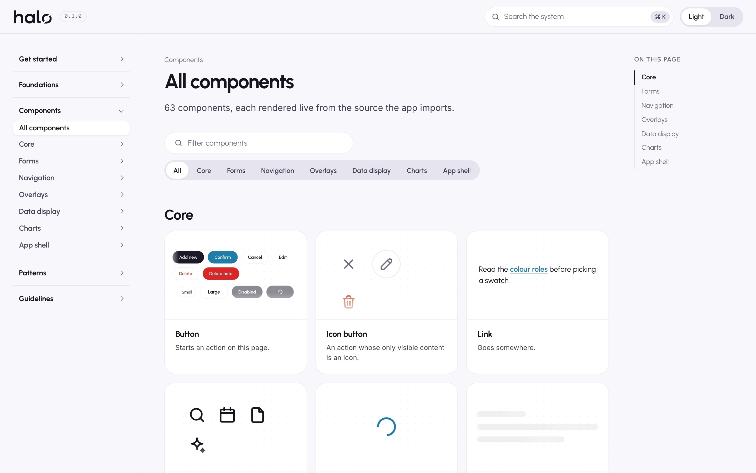
Halo ships 63 Svelte 5 components across seven families: core, forms, navigation, overlays, data display, charts and the app shell. Twenty were extracted from components the app already relied on; the rest were designed new to replace patterns the audit found copied by hand.
They were drawn to match Salutis as it ships, not an idealised version the product would have to catch up with. Each one reads only component tokens, which read semantic roles, which read the palette. Dark mode changes the roles and nothing else.
The documentation site imports the same source the app imports. Every example is the real component running live, in light and dark. A picture of a component is not documentation of the system.
63 components, seven families
Built new · 43Extracted from the app · 20
Core14
- Avatar
- Badge
- Button
- Icon
- IconButton
- InfoHint (Extracted from the app)
- Link
- ProfileDot (Extracted from the app)
- ProgressBar
- Skeleton (Extracted from the app)
- Spinner
- StatusChip
- Tag
- Tooltip
Forms14
- Checkbox
- Combobox
- DatePicker (Extracted from the app)
- FileDropzone
- ProfilePicker (Extracted from the app)
- RadioGroup
- RangeSlider
- SearchField
- Select (Extracted from the app)
- Switch (Extracted from the app)
- TagInput
- Textarea
- TextInput
- TimePicker (Extracted from the app)
Navigation07
- Breadcrumbs
- Menu
- Pagination
- SegmentedControl
- Stepper
- Tabs
- TreeView (Extracted from the app)
Overlays06
- ConfirmDialog (Extracted from the app)
- Dialog
- Popover
- SidePanel (Extracted from the app)
- ToastRegion
- Tour (Extracted from the app)
Data display10
- Accordion
- Card
- ChartFrame
- DataTable
- EmptyState (Extracted from the app)
- InlineAlert
- RichText (Extracted from the app)
- SelectionBar (Extracted from the app)
- SortMenu
- Tile
Charts07
- BarChart
- DonutChart
- Gauge
- LineChart
- RadarChart
- RangeIndicator
- Sparkline
App shell05
- AccountPicker (Extracted from the app)
- AppHeader (Extracted from the app)
- AppSidebar (Extracted from the app)
- CommandSearch (Extracted from the app)
- DocumentTabBar (Extracted from the app)
04Component design
Designed down to the rule.
Each component was specified before it was built: what it is for, the variants it allows and the ones it refuses, the metrics it takes from the token scale, how it behaves with a keyboard, and what it replaced in the app.
The rules matter as much as the drawing. A button names the outcome. A status is always a dot and a word. A field error replaces the hint and tells you how to fix it. These are written on every component page, so the next screen does not have to rediscover them.
Four of the components, as they were designed.

Button
Starts an action on this page.
- Variants
- neutral, primary, secondary, ghost, danger-ghost, danger
- Sizes
- 32, 40 and 44 px on the control scale. Pill radius.
- States
- Default, hover, focus ring, disabled, loading
- Rule
- One neutral action per area. A confirmation in a dialog is primary. A destructive confirm names its object.
- Replaces
- .btn-primary, .save-button, .add-new-btn and 102 other class names
Text input
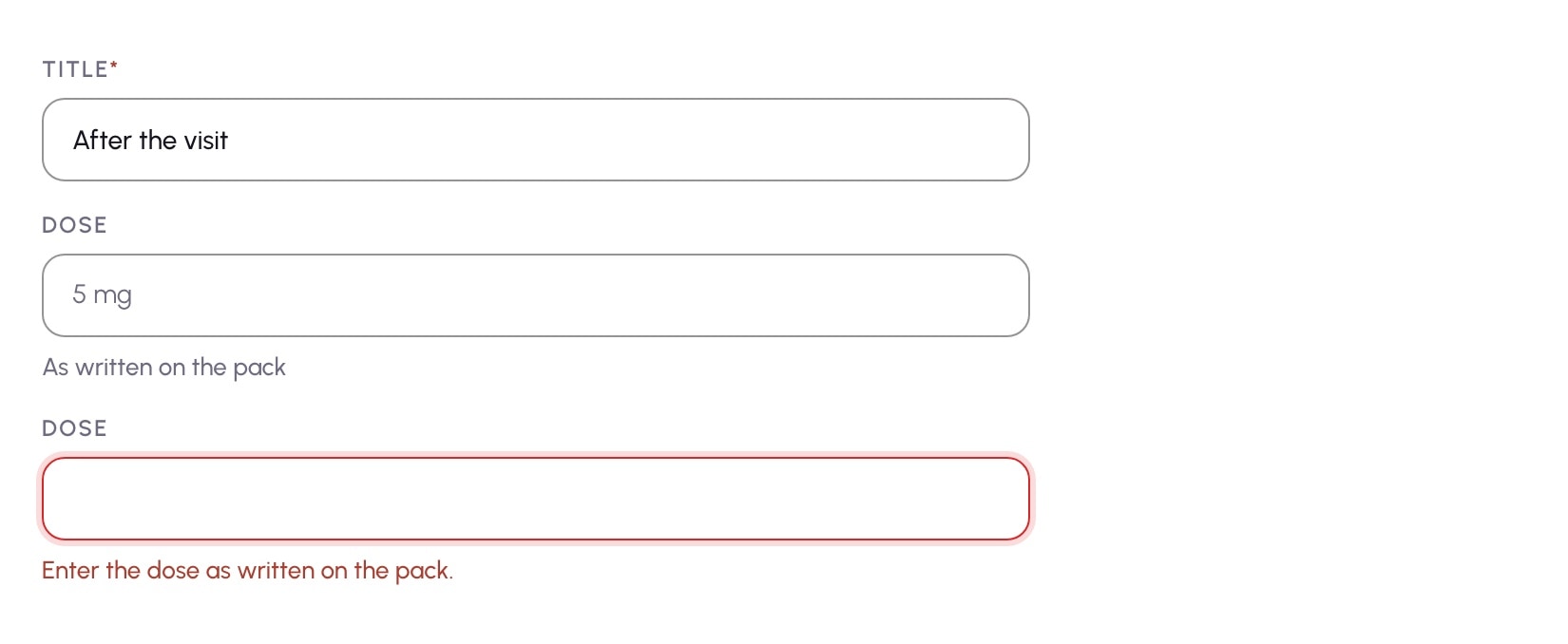
A single line of text, with its label, hint and error.
- Anatomy
- Eyebrow label, control, then a hint or an error in the same slot
- Metrics
- 44 px tall, the minimum touch target. 12 px radius.
- Contrast
- Field border raised from 1.3:1 to 3:1 (WCAG 1.4.11)
- Rule
- Required is marked in the label. The error replaces the hint and says how to fix the field. A placeholder is an example, never the label.
- Access
- The error is announced as an alert and linked to the field

Status chip
The state of a record, as a dot and a word.
- Statuses
- ok, attention, critical, info, neutral, pending
- Appearance
- soft, outline, plain. Sizes sm and md.
- Rule
- The word is always there. Colour is never the only meaning.
- Boundary
- The product decides whether a value is in range. Halo only shows the answer.
- Replaces
- Status badges built in 26 files, two of them with palettes hardcoded in script
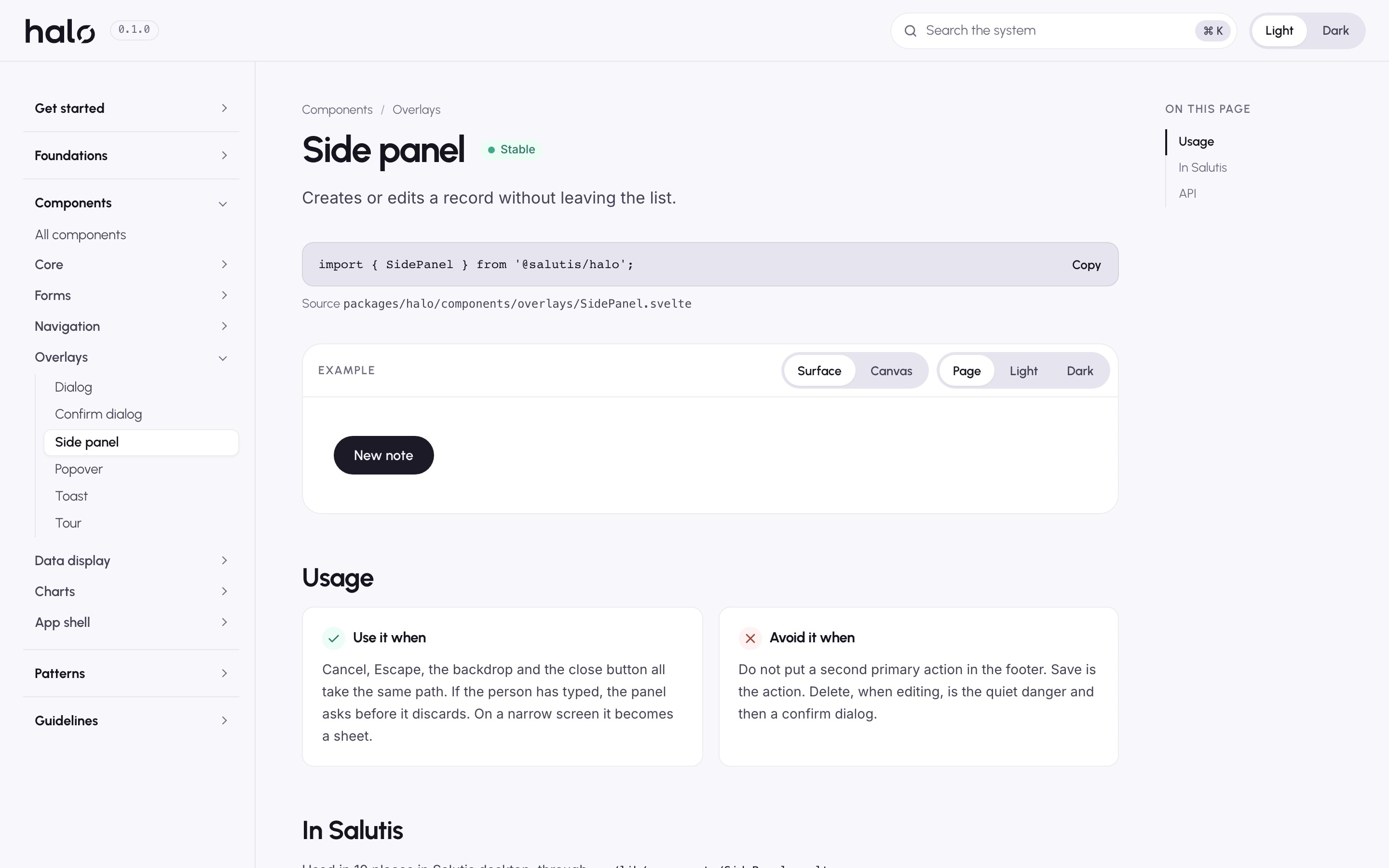
Side panel
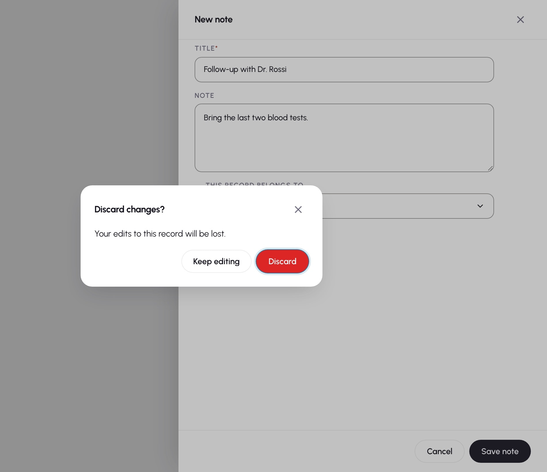
Creates or edits a record without leaving the list.
- Layout
- 640 px beside the list. A sheet on narrow screens.
- Footer
- Delete when editing, Cancel, Save. One primary action.
- Closing
- Cancel, Escape, the backdrop and the close button take one path. A dirty panel asks first.
- Layers
- Panel at 1100, its confirmation above at 1200, from one z-index ladder
- Focus
- Traps Tab and returns focus to the control that opened it
05Behaviour
Nothing typed gets lost.
Behaviour is part of the system, not something each page rediscovers. Dialogs, the side panel and the guided tour share one overlay stack. Scroll locks with a reference count, Escape closes only the top layer, and dialogs and the panel trap focus, then return it to the control that opened them.
The audit had found the opposite: no focus trap anywhere, Escape ignored by the two most used overlays, and record panels that discarded what you typed when you closed them. Halo fixed each of these once, in the component, so every page that uses it inherits the fix.
Accessibility, before and after
- Dialog semantics
- Before Halo: 8 of 19 overlay implementations declared role="dialog"
- With Halo: Dialog, side panel, popover and tour share one labelled shell
- Focus
- Before Halo: No focus trap anywhere, no focus restore on close
- With Halo: Dialogs and the panel trap Tab and return focus to the opener
- Escape
- Before Halo: Ignored by SidePanel and ConfirmationModal
- With Halo: Closes the top layer only; a dirty panel asks first
- Unsaved edits
- Before Halo: Closing a record panel discarded what was typed
- With Halo: Notes, medications and appointments ask before discarding
- Field borders
- Before Halo: Input boundary at 1.3:1 contrast
- With Halo: Raised to 3:1 (WCAG 1.4.11), checked by script
- Announcements
- Before Halo: Toast markup copied in 22 files
- With Halo: One region: status for info, alert for warnings
06The boundary
Presentation, not medicine.
The product is a health archive, and that set the boundary from the first day. A design system that began inventing clinical rules would be worse than none.
Halo decides how things are shown. Whether a lab value is out of range, who a record belongs to, and what the assistant is allowed to say are decided by the app and handed to Halo as data. The line is written into the principles, the tokens and the component APIs.
Halo decides.
- How a status looks and reads.
- Which layer sits above which.
- What Escape does, and when a panel asks before closing.
- How an error is worded and announced.
Salutis decides.
- Whether a value is in range.
- Who a record belongs to.
- What the local assistant may say.
- What a document means.
- 01One source.
- 02Presentation, not medicine.
- 03Colour is never the only meaning.
- 04The existing API survives a release.
- 05Tokens before hex.
- 06Quiet by default.
- 07Write the state down.
07Identity
A mark built like the system.
Halo needed an identity of its own, one that could sit beside the Salutis logo without competing with it. The mark is called Continuità: two ribbons made from a single construction module, the second rotated 180° around the first. Two halves of one record, held in a loop.
It is drawn on a 256 grid with concentric arcs and parallel 45° cuts, and every brand file is generated from that one geometry module, so no size of the mark is ever redrawn by hand. The same module becomes the o of the wordmark. The rule that governs the components governs the mark: one source, reused exactly.
Construction
Continuità
- Grid
- 256
- Outer radius
- 104
- Inner radius
- 62
- Cut
- 45°
- Rotation
- 180°
08Adoption
Adopted in a running product.
Halo arrived inside Salutis without a rewrite. The app's old CSS variables kept their names and now point into Halo's tokens, so the interface rendered unchanged on the day the system arrived.
Eight shared components became adapters. Pages keep their old props, events and even the class names the tests look for, while the adapter renders Halo underneath. Moving a page onto the new API is a decision, not a side effect.
Eleven pages that each implemented their own toast now call one notify function, and one toast region is mounted for the whole app. Both builds, desktop and mobile, complete on the adopted code.
How the app moved without a rewrite
- 01 / Page
<SidePanel isOpen={open}
  title="New note"
  on:close on:save>
Unchanged. Same props, same events.
- 02 / Adapter
src/lib/components/
SidePanel.svelte
Keeps the legacy API and the class names tests look for.
- 03 / Halo
<SidePanel {open} {dirty}
  onclose onsave />
Svelte 5 runes. Focus trap, layer stack, dirty check.
SidePanelConfirmationModalEmptyStateCustomSelectProfileDotToggleSkeletonInfoHint- Importing files50
What changed.
- Token CSS imported app-wide, light and dark.
- Side panel and confirmation on Halo, old class names intact.
- Unsaved edits protected in three record panels.
- One toast region instead of eleven implementations.
- No failing required contrast pairs.
What is still catalogued.
- Domain cards, lab widgets and AI panels keep their own layout.
- The tables in Documents, Invoices, Lab and Deleted.
- The live sidebar and header. AppSidebar and AppHeader are ready for the next adoption.
- Most literal hex values inside page styles.
09In production
Every screen, accounted for.
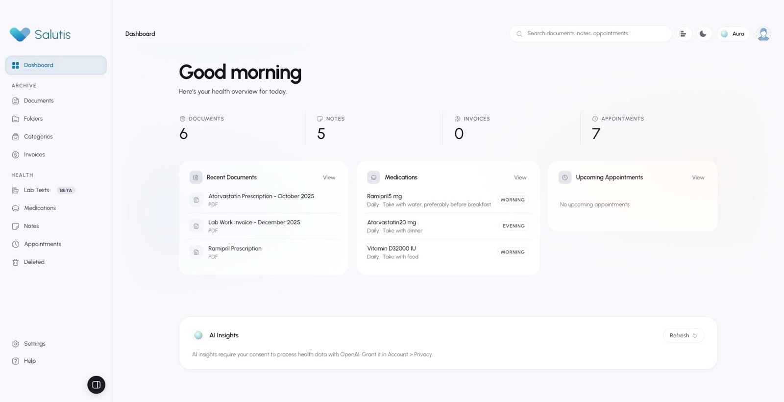
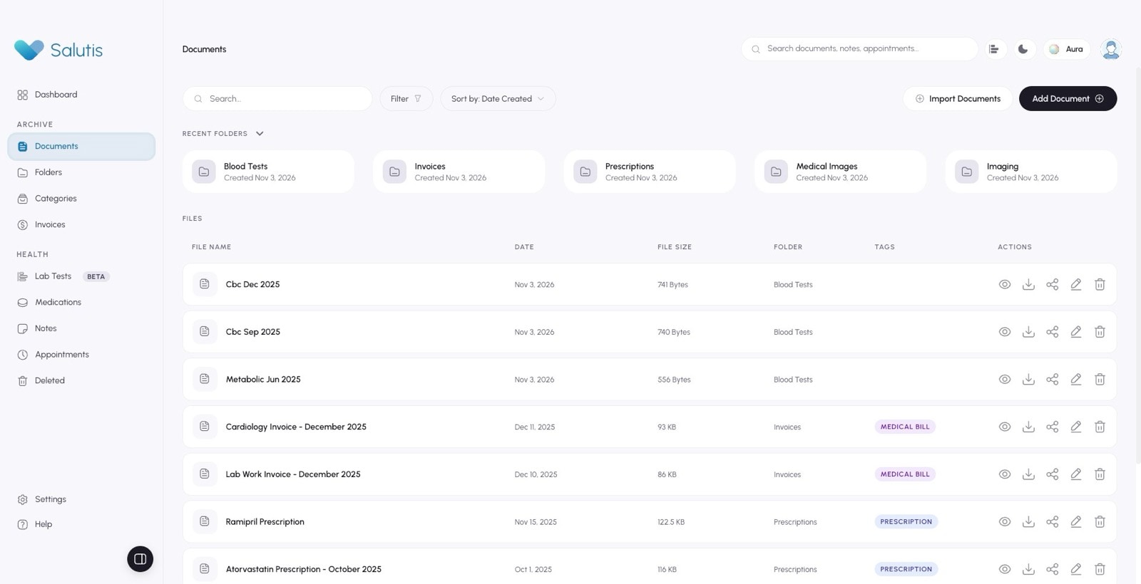
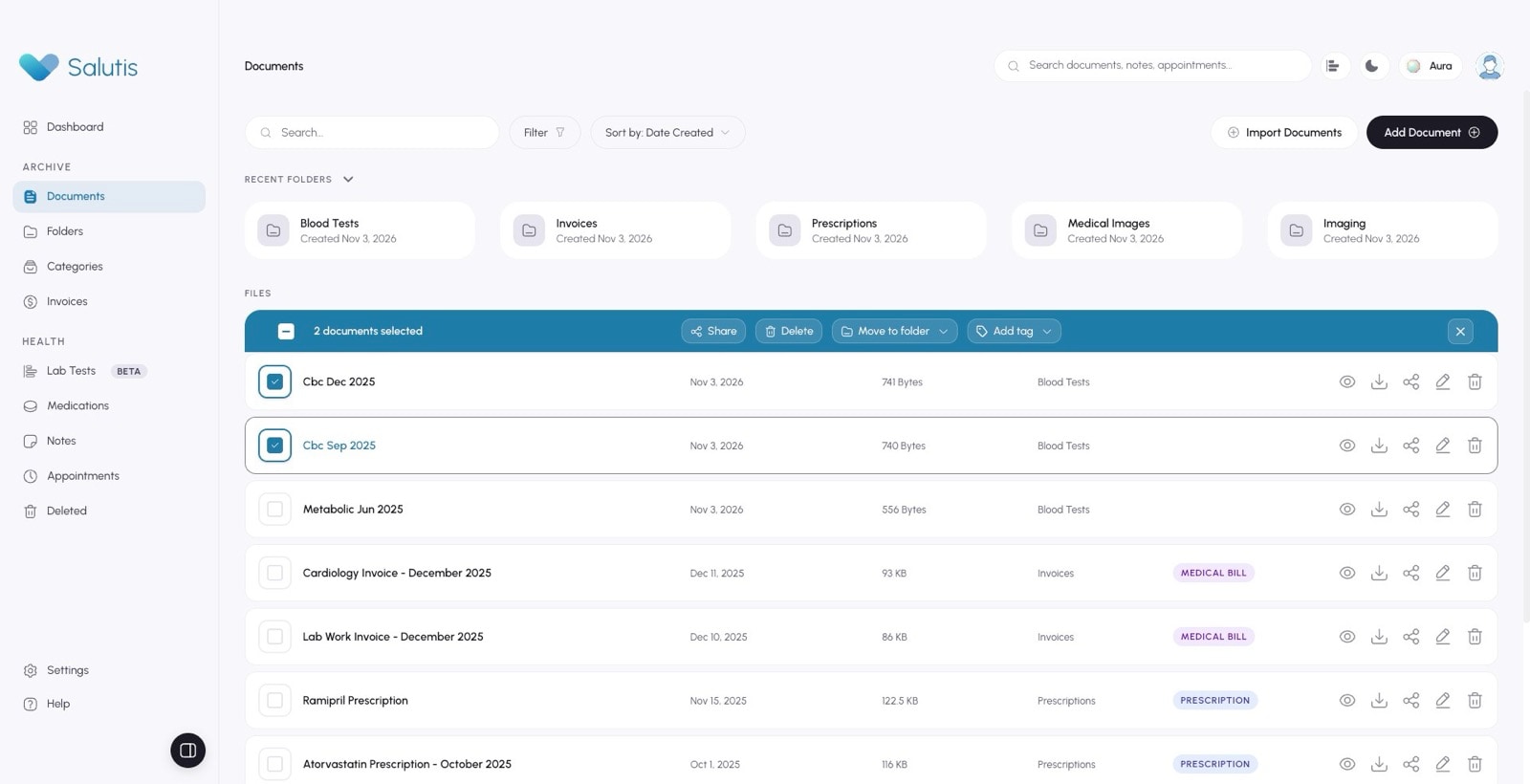
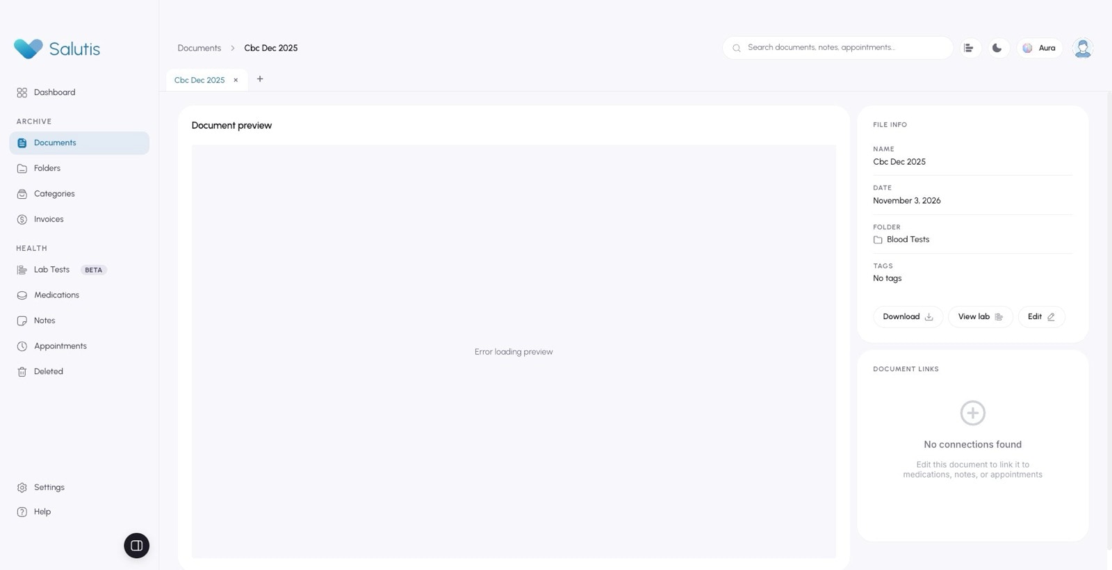
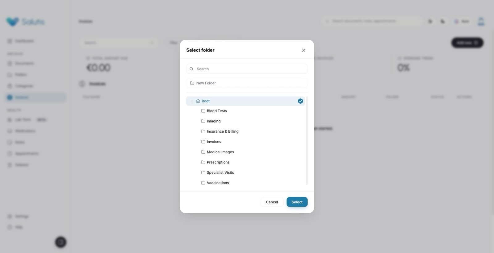
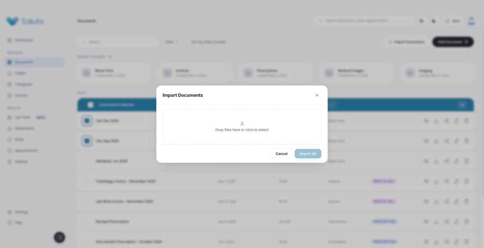
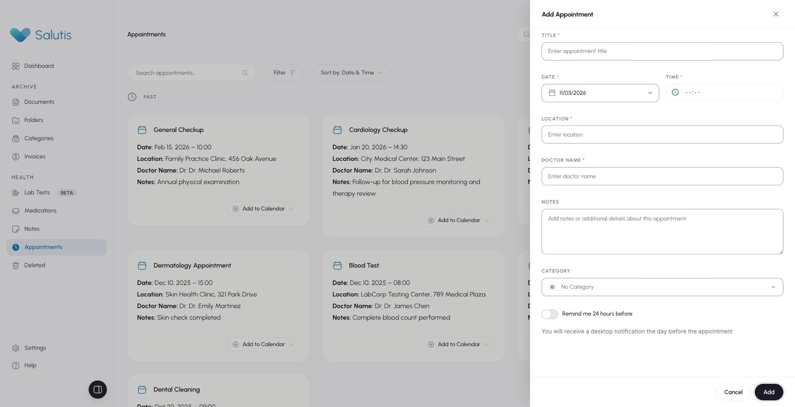
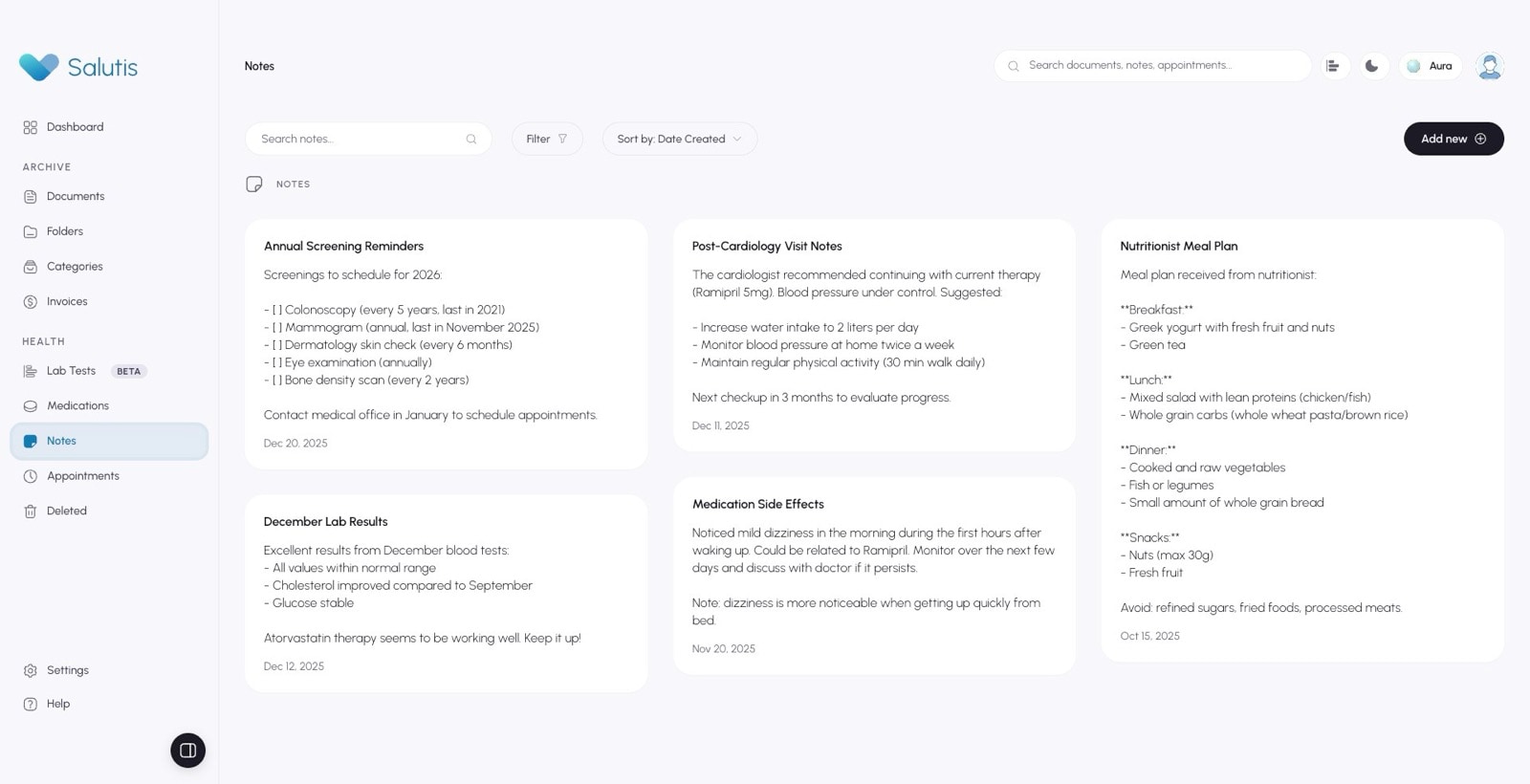
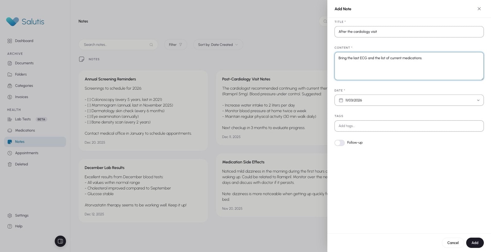
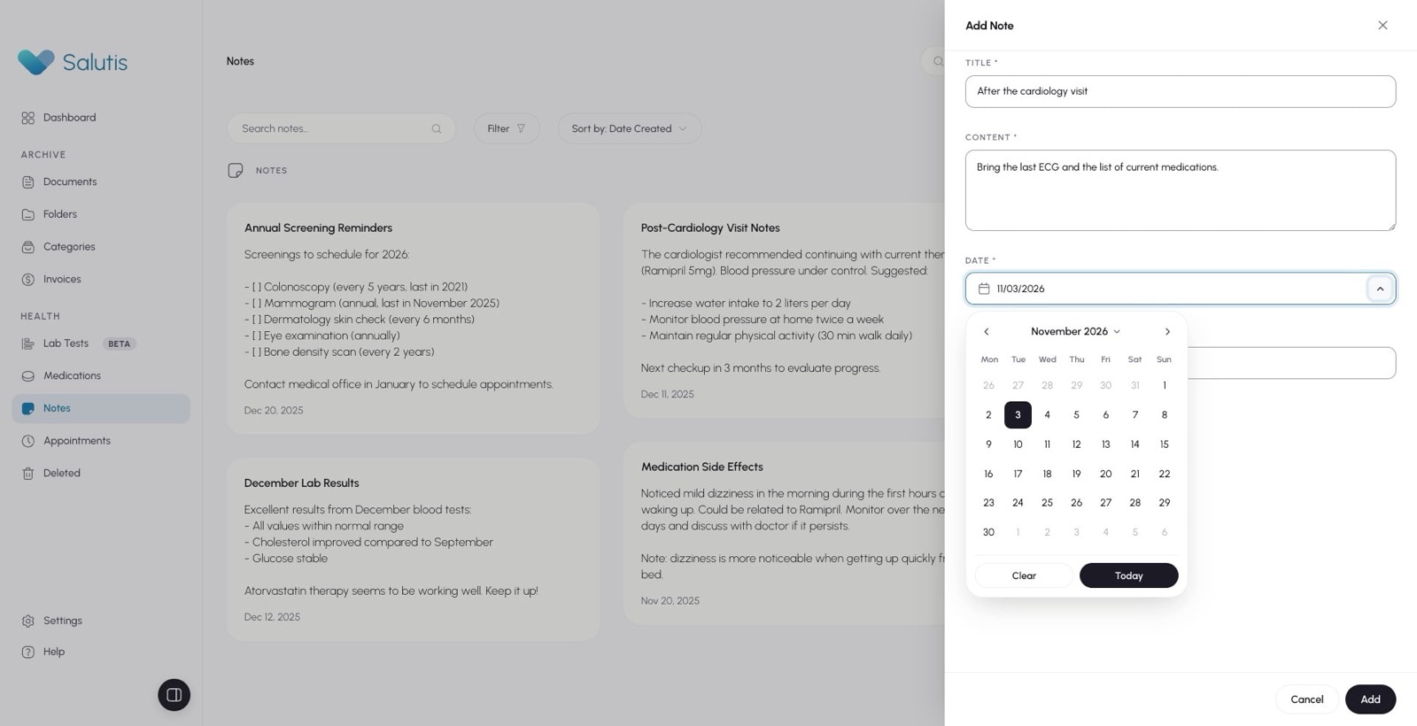
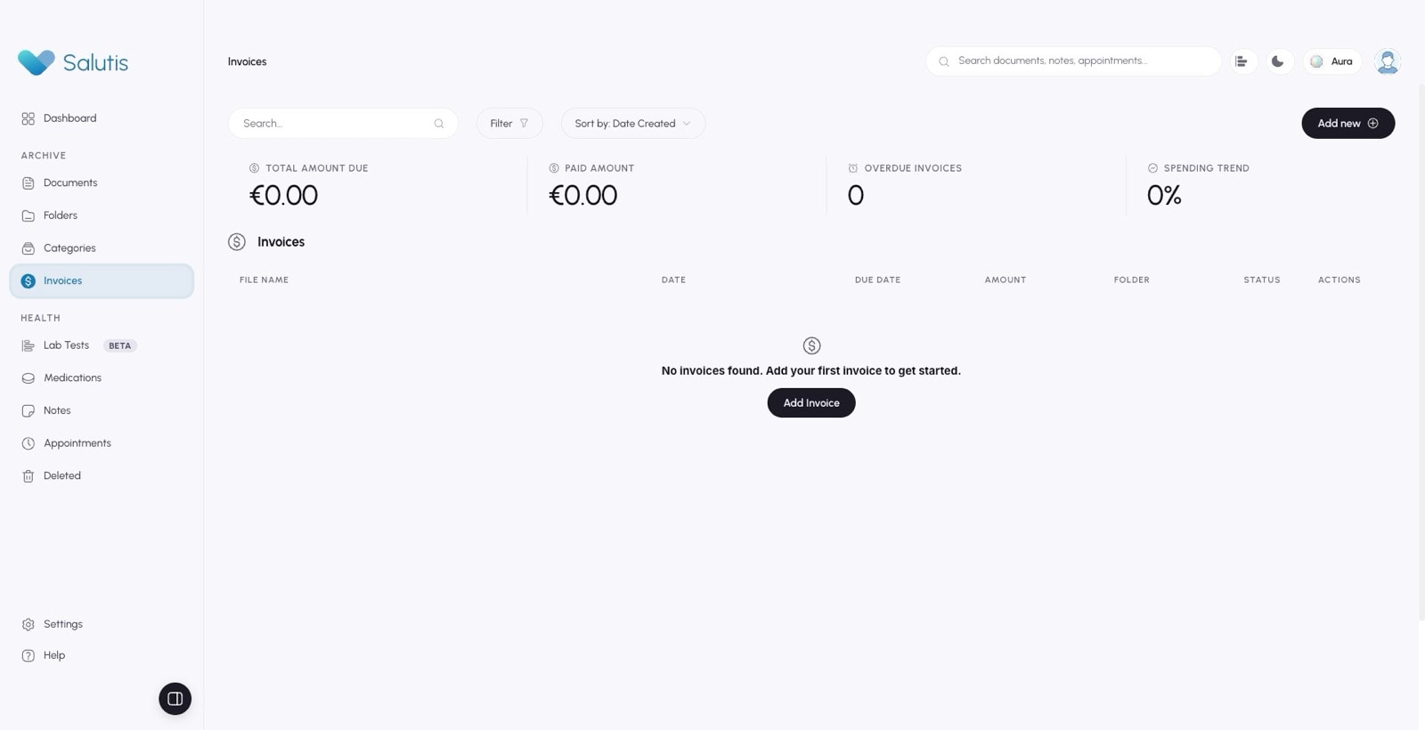
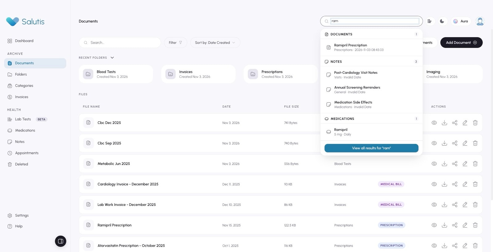
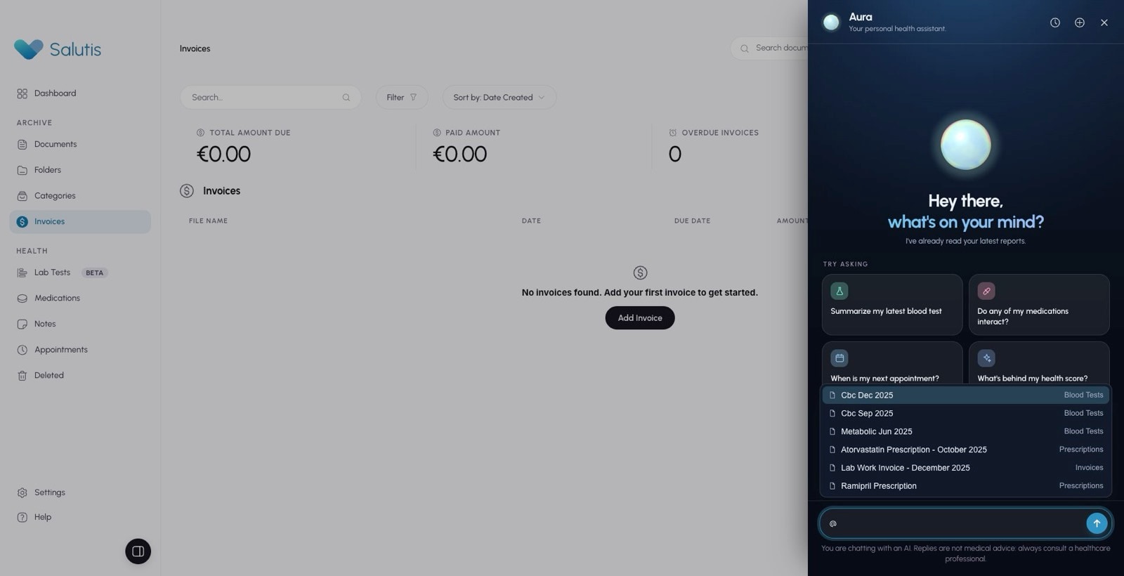
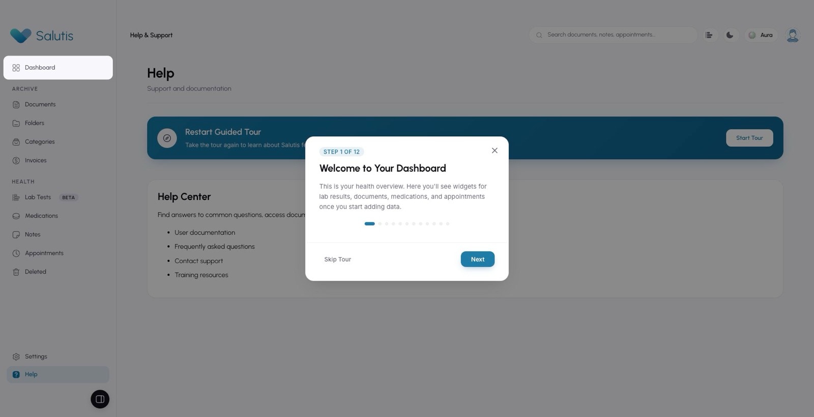
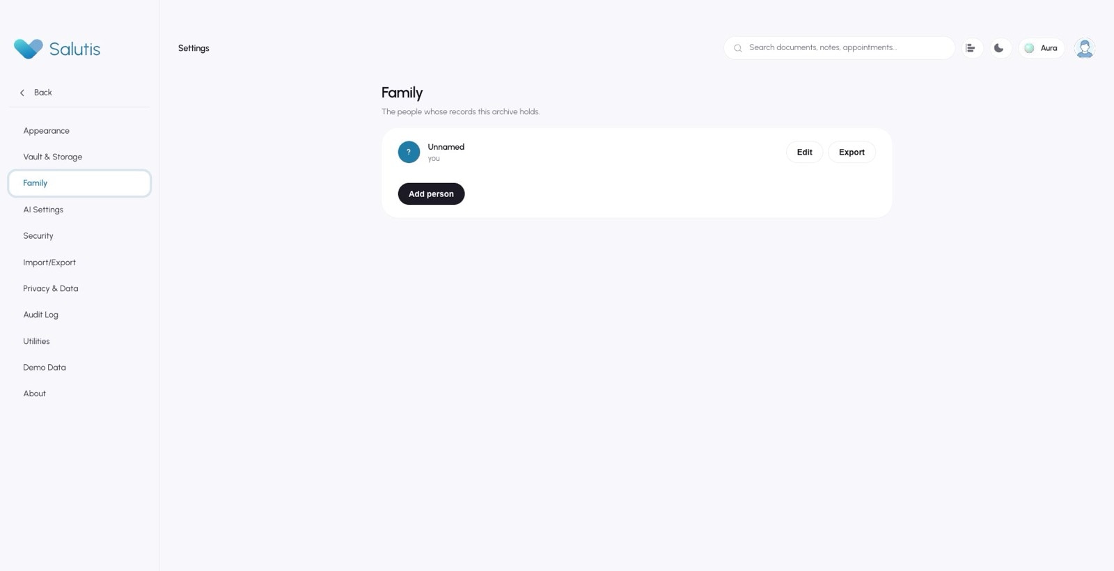
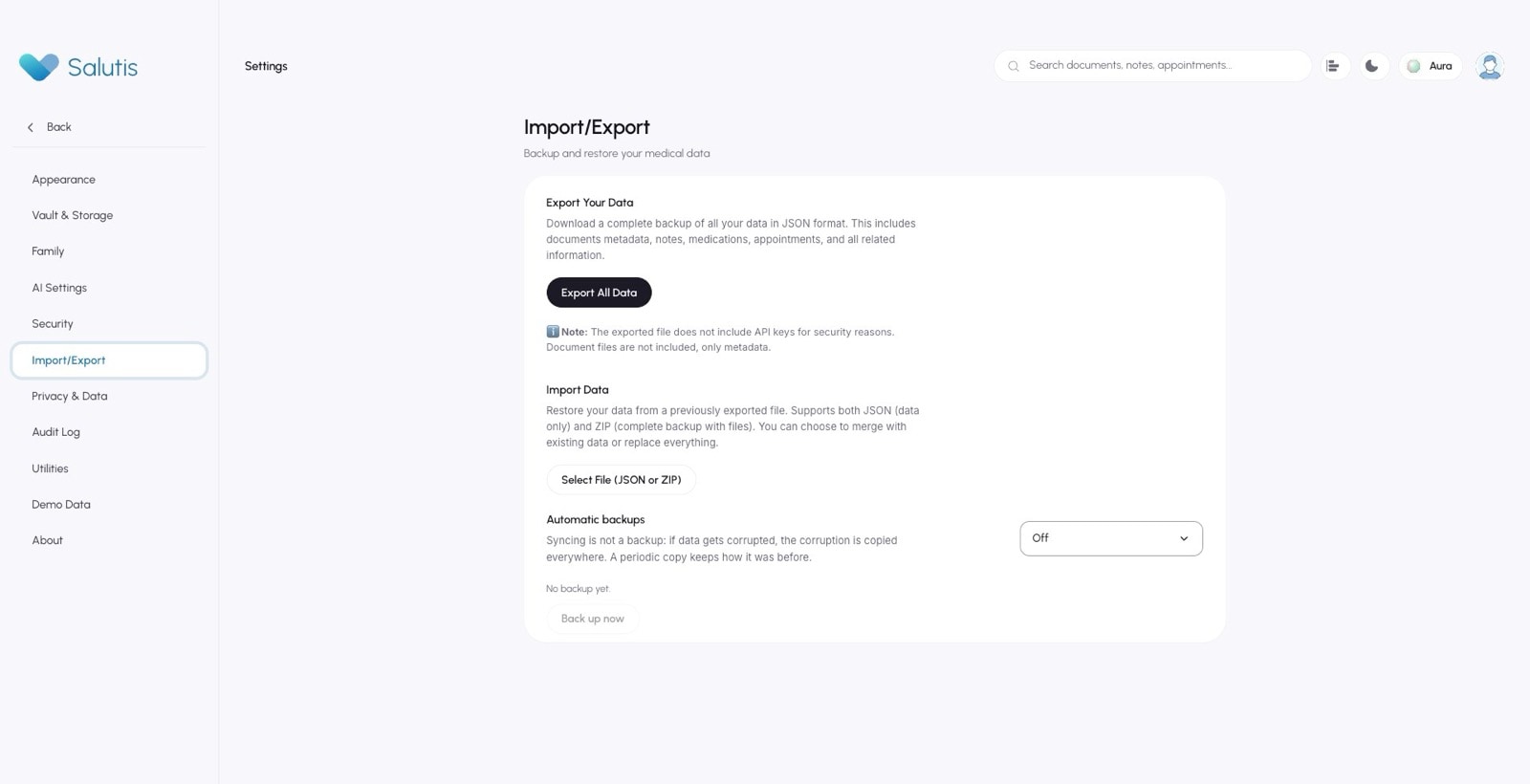
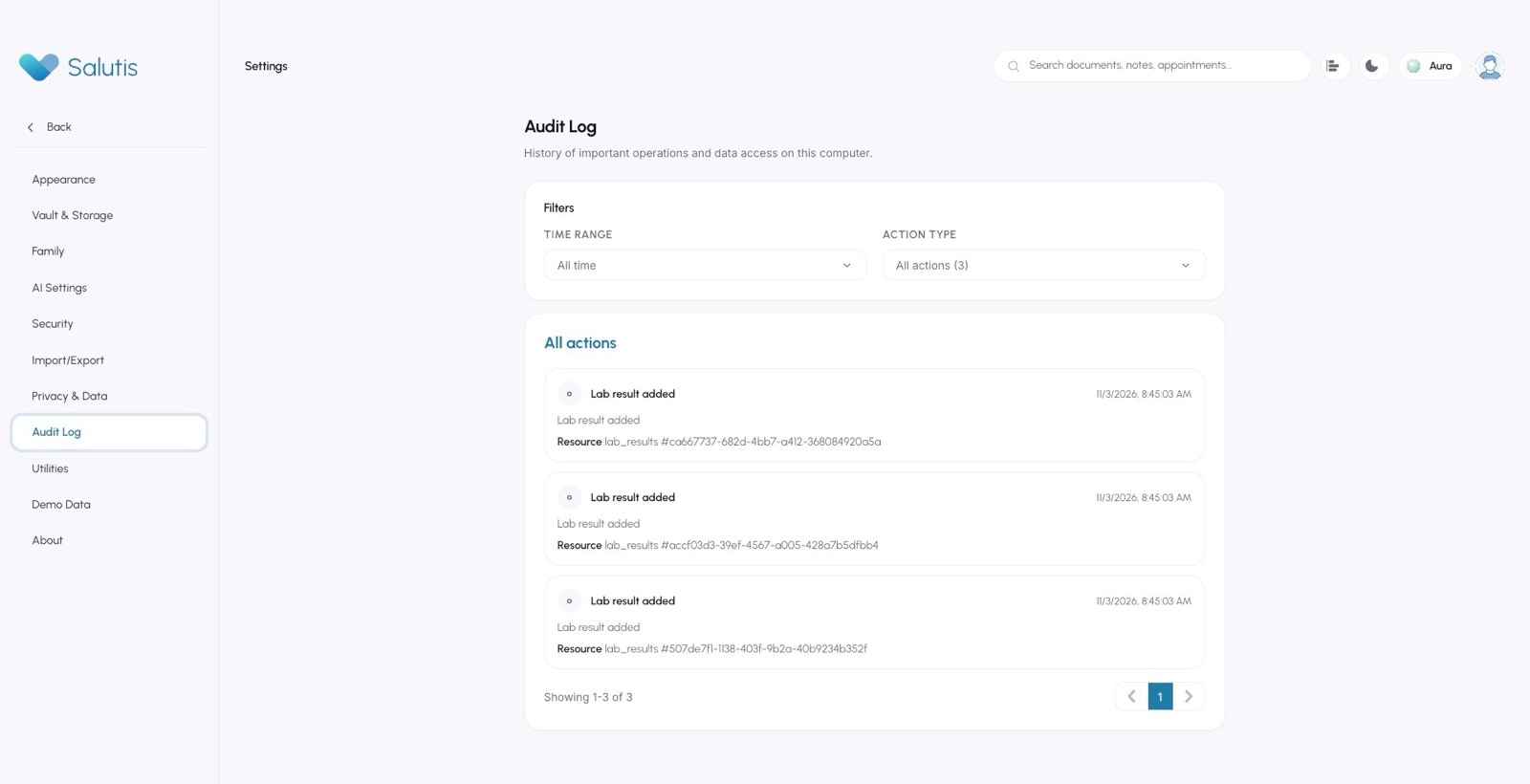
Salutis ships 33 desktop screens, from the dashboard and the lab wizard to settings and the audit log. The documentation links each component to the screens where it appears, so a change to the system can be traced to everything it touches.
These captures come from the real Electron app, run in a throwaway vault with demonstration data, so the evidence never touches anyone's records.
33 screens, mapped to the components they use
- dashboard
- documents
- documents selection
- document preview
- folder explorer
- import documents
- lab list
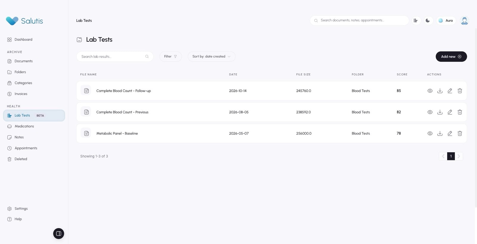
- lab
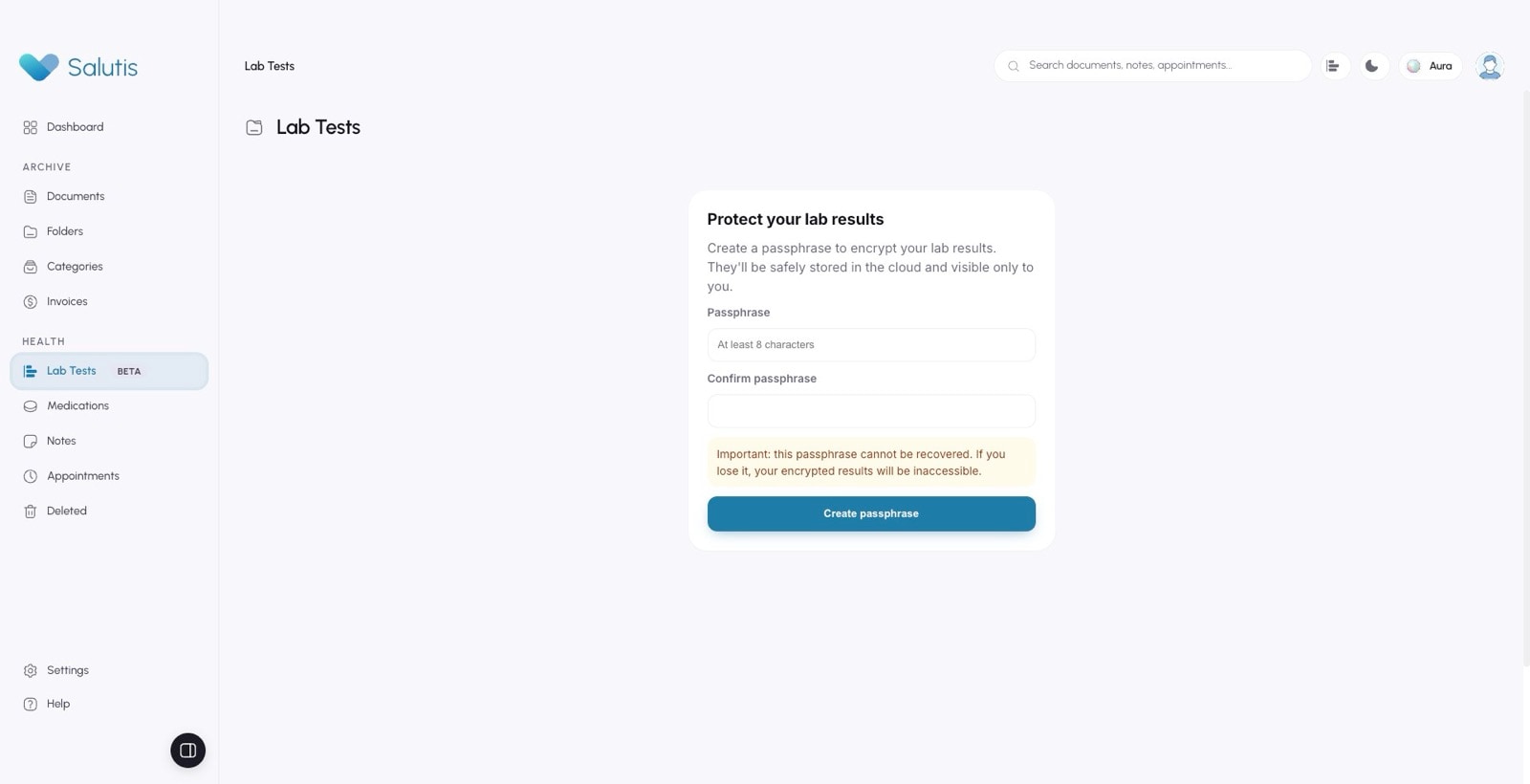
- lab wizard
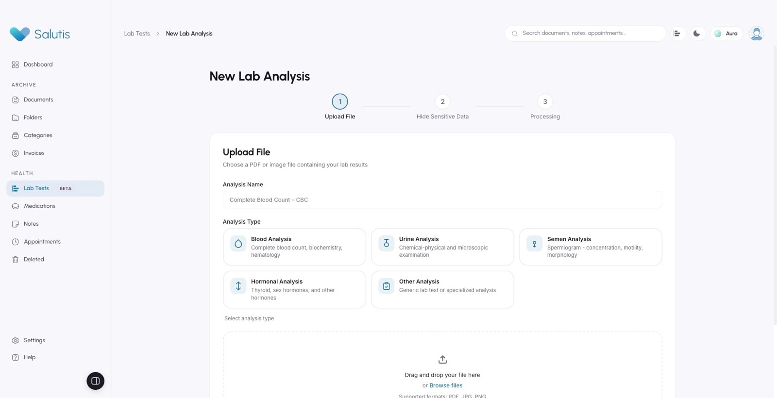
- lab analysis
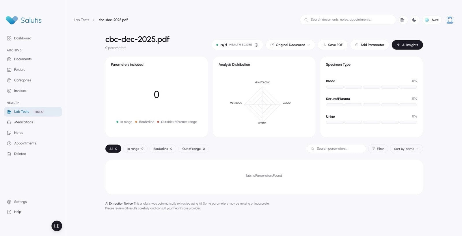
- lab analysis more
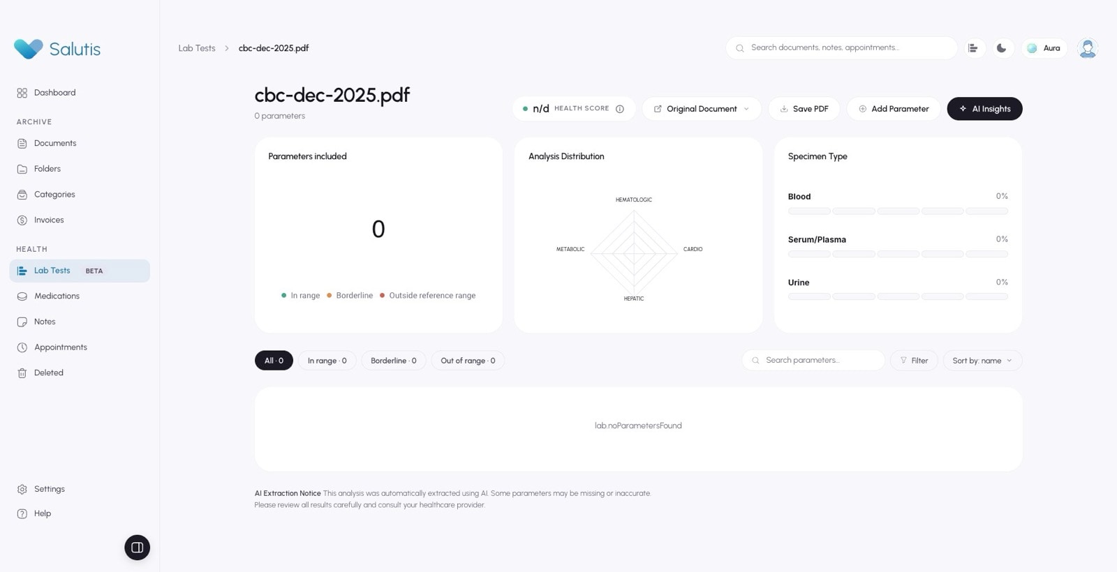
- timeline
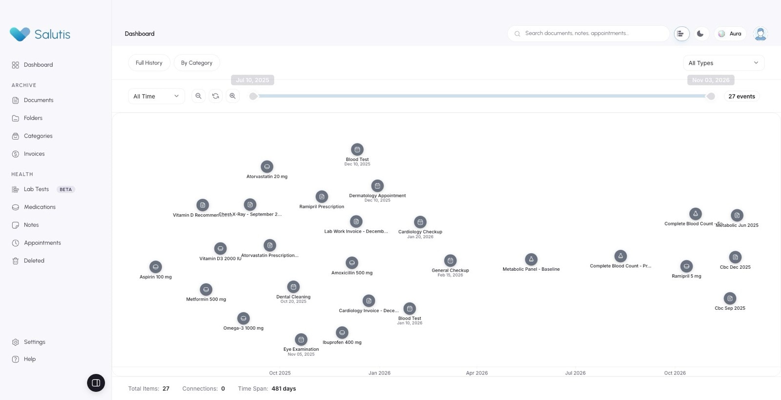
- medications
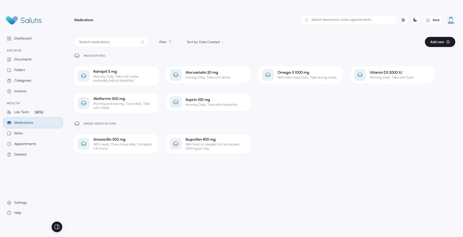
- medication panel
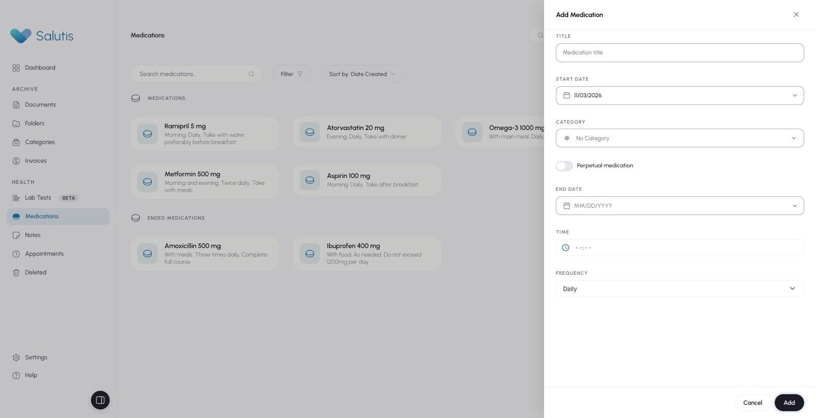
- appointment panel
- notes
- note panel
- note panel date
- note saved
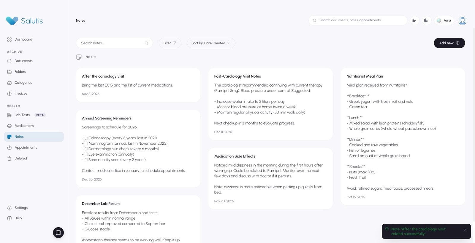
- note delete
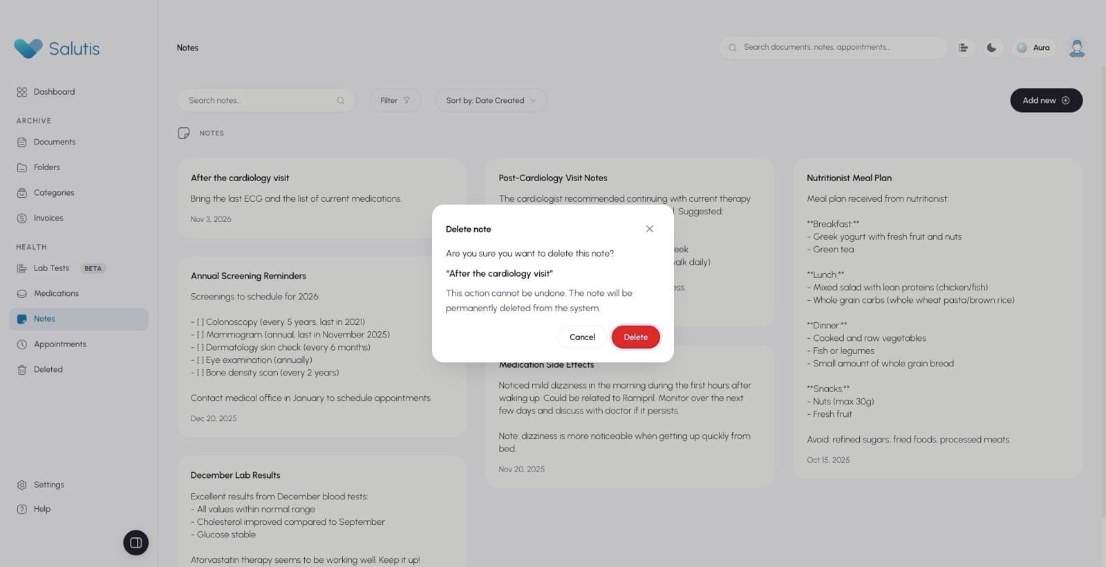
- notes filter
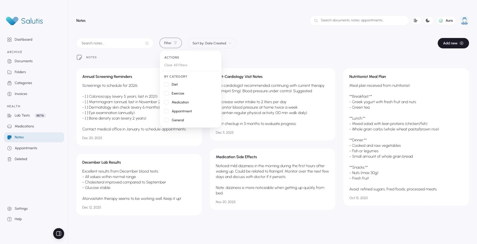
- notes sort
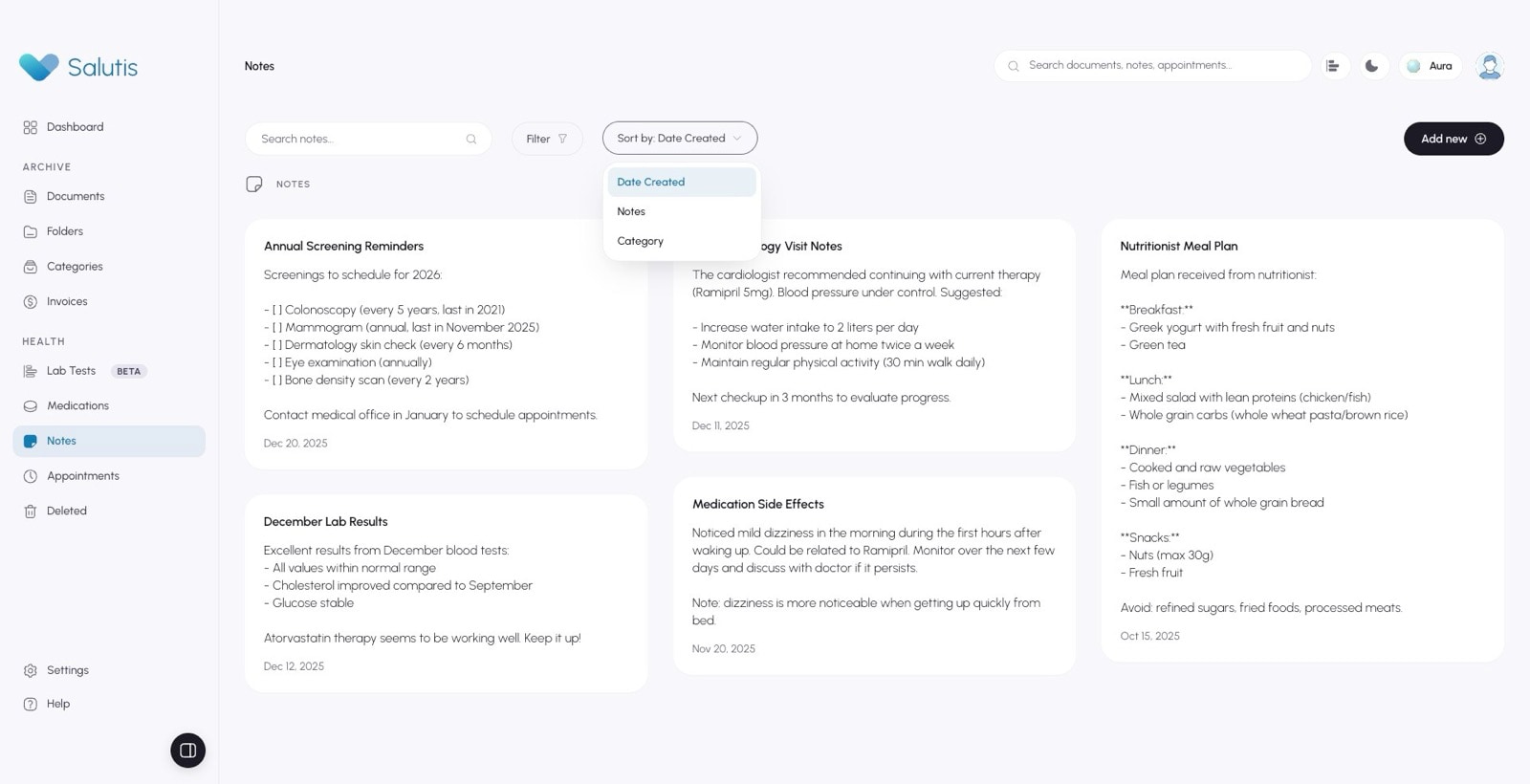
- invoices
- global search
- assistant
- guided tour
- settings
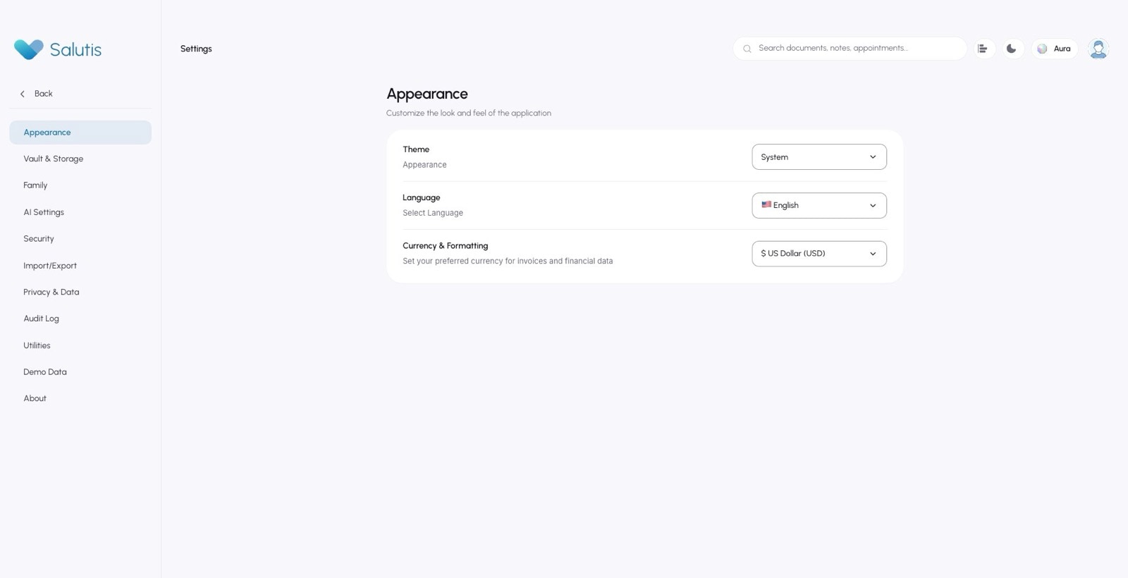
- settings security
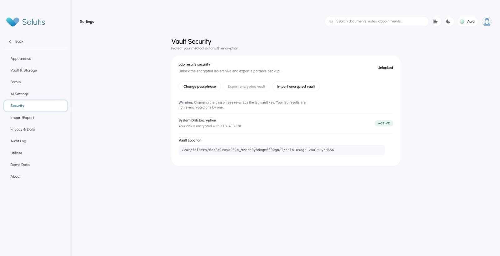
- settings privacy data
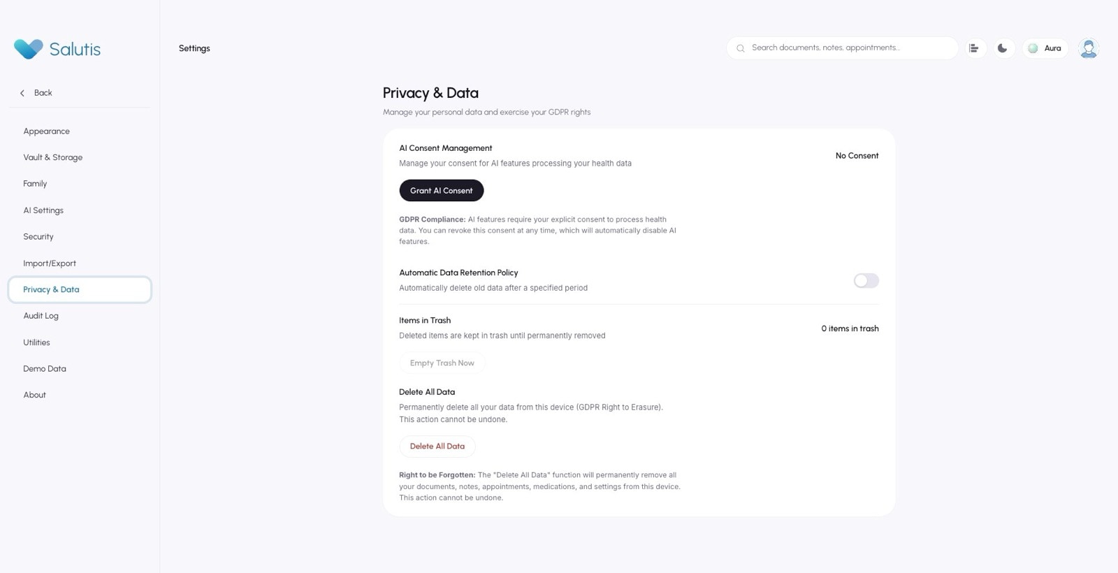
- settings ai settings
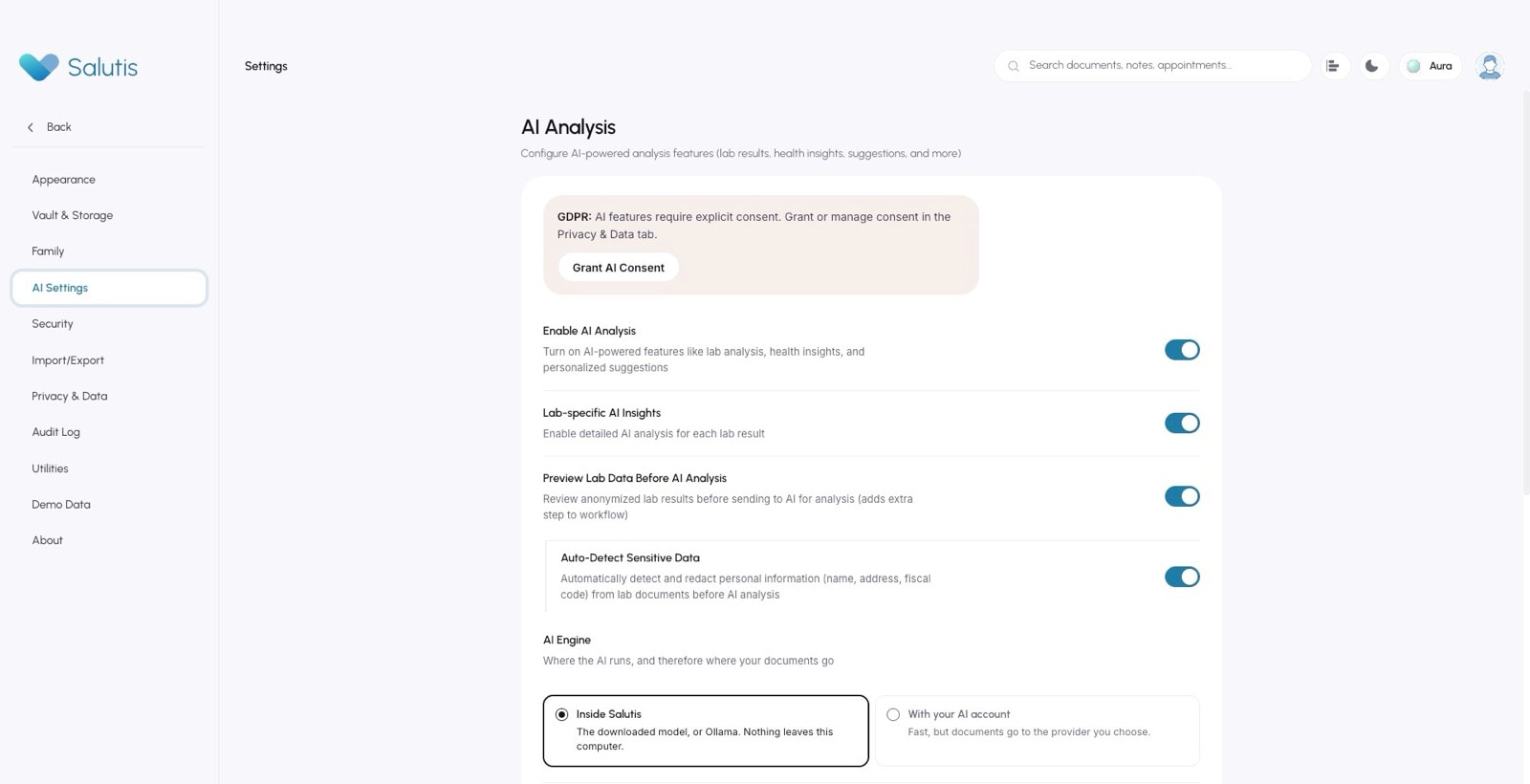
- settings family
- settings import export
- settings audit log
10Documentation
Documentation as a product.
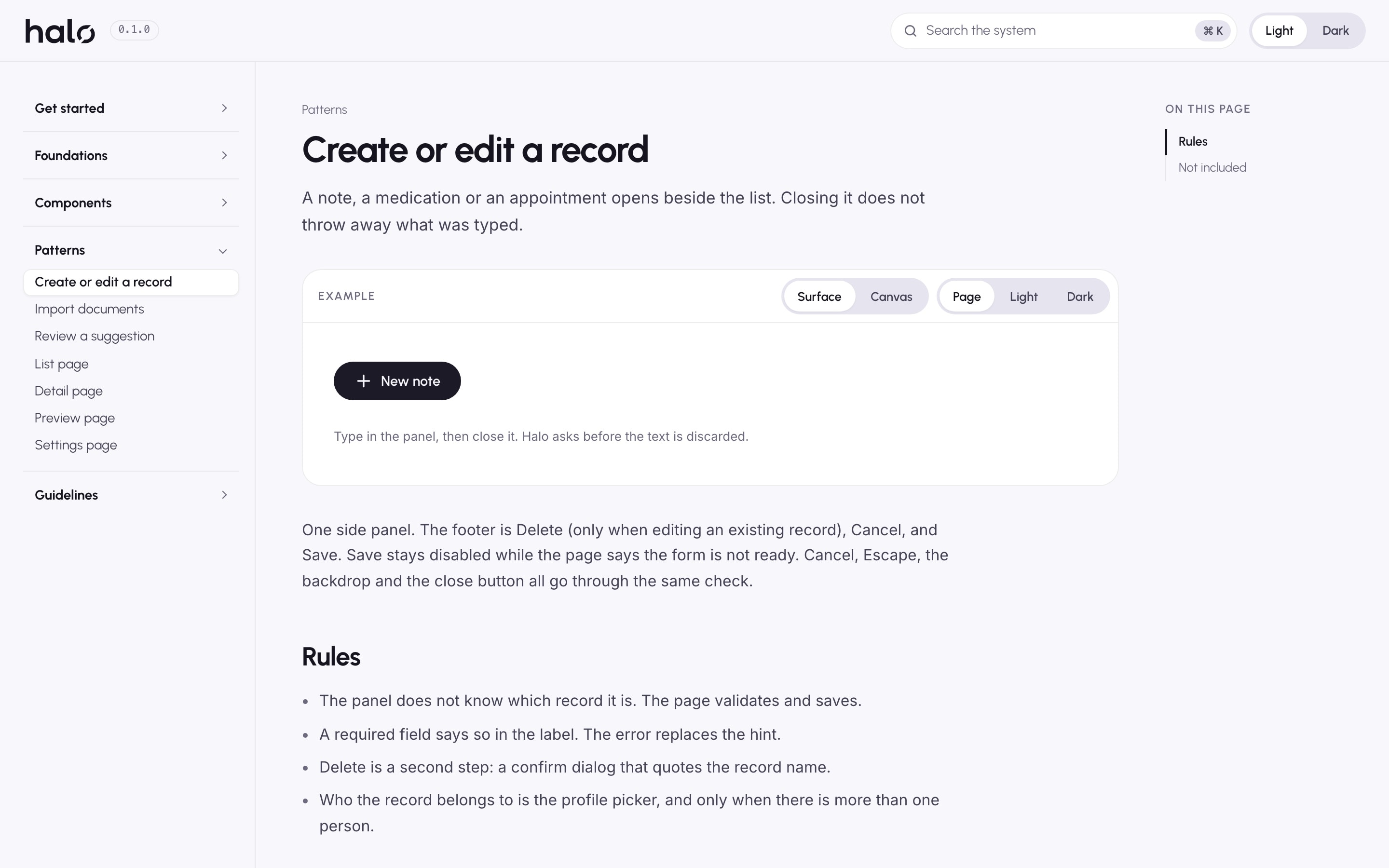
The documentation site is the place a designer or engineer actually meets Halo: 87 pages covering principles, foundations, every component and seven patterns, with search, light and dark, and the real components running on every page.
Every component page follows the same structure: what it is for, when to use it and when not to, where it lives in Salutis, and an API table read straight from the component's source, so the page cannot drift from the code.
Scripts keep the system honest. They rebuild the tokens for CSS and Figma, check contrast, report which components are documented, and capture the app for evidence.
The system checks itself
npm run tokensCSS variables, per-theme JSON and the Figma variable file, from one DTCG source
npm run contrastEvery required colour pair against WCAG 2.2 AA, written to a report
npm run statusWhich components exist and whether each one has a documentation page
npm run captureScreenshots of the real Electron app in a throwaway vault, for evidence
11The honest result
A system that says what it is not.
Halo 0.1.0 is a foundation the product already stands on: tokens with a single source, components documented by running them, behaviour that protects what people type, and adapters that let the rest of the app move over on purpose.
It is also honest about its edges. No usability test was run, and no claim is made that the new components are faster to use or that any clinical outcome changed. The known gaps are written into the accessibility docs rather than left for someone to find.
That is the part I care about most. A design system for a health product earns trust the same way the product does: by being precise about what it decides, and about what it leaves to someone else.
- 63
- Components, all live on the documentation site
- 87
- Documentation pages
- 33
- Salutis screens mapped to the system
- 0
- Failing required contrast pairs